
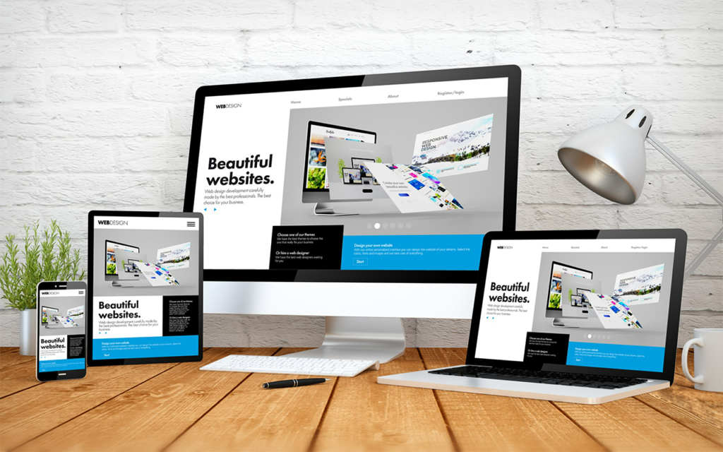
Responsive Design Done Right: Shaping the Web for Every Screen
Hey there, conversion rate warriors! You might be surprised to learn that your website’s design is a secret weapon in the battle for online dominance. But not just any design – we’re talking about responsive web design (RWD). In today’s multi-device world, websites need to be chameleons, seamlessly adapting to desktops, tablets, and smartphones. Enter responsive web design (RWD) – the cornerstone of a user-friendly online experience across all screen sizes.
Why Responsive Design Matters
Imagine a website that looks great on your laptop but shrinks to an unreadable mess on your phone. Frustrating, right? Responsive design eliminates this pain point, ensuring your website delivers an optimal viewing experience regardless of the device.
Here’s a couple of reasons why Responsive Web Design is essential:
Enhanced User Experience
Imagine a world where your website magically adjusts to any device, offering a smooth and user-friendly experience for everyone. That’s the power of Responsive Web Design! Happy users are more likely to stick around, explore your offerings, and ultimately convert. Users shouldn’t have to zoom, scroll sideways, or wrestle with clunky layouts. RWD provides a smooth and intuitive experience, keeping visitors engaged.
SEO Benefits
Let’s face it, mobile browsing is king. Google rewards mobile-friendly websites in search results, making them easier to find. Responsive design ensures your website looks fantastic and functions flawlessly on smartphones and tablets, boosting your mobile traffic and conversion potential. In fact, Google prioritizes mobile-friendly websites in search results. Responsive Web Design ensures your site is easily discoverable by users on any device.
Reduced Maintenance
Maintaining separate mobile and desktop websites is a burden. RWD simplifies website management and reduces costs. Gone are the days of managing separate mobile and desktop websites – a double headache! RWD simplifies website management, saving you time and resources to focus on what matters: growing your business.

Building a Responsive Website: Core Principles
So, how do you create a website that bends but doesn’t break? Here are the key ingredients:
Flexible Layouts: Ditch the One-Size-Fits-None Approach
Imagine a website layout that’s like a comfy sweater – it adjusts to fit different body types (screens in our case!). This is achieved by saying goodbye to fixed-width designs, where elements are confined to a specific pixel size.
Here’s where CSS media queries come in as your secret weapon. These are like questions your website asks itself, like “Is the screen size smaller than 768 pixels?” Based on the answer, the website applies different styles to adjust the layout.
Think of your website’s elements – columns, sidebars, content blocks. With media queries, you can define how these elements resize and rearrange themselves on smaller screens. For example, a website with a beautiful two-column layout on a desktop might switch to a single column on a phone, ensuring everything stays readable and clickable.
Fluid Grids: The Website’s Flexible Skeleton
Every great website needs a strong foundation. For responsive design, that foundation is the fluid grid system. Think of it as the invisible skeleton that holds your website’s content in place.
Here’s the magic: unlike a fixed grid with rigid pixel measurements, a fluid grid uses relative units like percentages or ems. This allows elements to resize proportionally based on the screen size. Imagine a website with three content blocks arranged in a row using a fluid grid. On a large screen, each block might take up 33% of the space. On a smaller screen, the grid adjusts, ensuring all three blocks still fit comfortably without overlapping.
Scalable Images: Keeping Your Visuals Crisp on Any Screen
Nobody wants blurry or pixelated images that look like they belong in a game of Tetris gone wrong. Responsive design ensures your website’s visuals stay sharp and engaging across all devices.
The key lies in using the right image formats. Scalable formats like JPEG or PNG allow images to compress without losing significant quality. Additionally, CSS techniques like max-width and height: auto can be used to ensure images resize proportionally and don’t break the layout on smaller screens.
By combining these elements – flexible layouts, fluid grids, and scalable images – you create a website that’s like a responsive chameleon, adapting to its environment (the screen size) to deliver an optimal viewing experience for every visitor, no matter what device they use.
Once you’ve grasped the core principles, explore responsive design patterns to tackle common layout challenges. Here are a few popular ones:
Stacking: Elements stacked vertically on desktops can switch to a single column layout on mobile devices.
Hiding and Showing: Certain elements might be hidden on smaller screens to prioritize essential content.
Media Queries: These CSS queries allow you to apply specific styles based on screen size or device orientation.
Responsive Design Done Right
Let’s take a look at some websites that showcase responsive design well
Apple: https://www.apple.com/ – Apple’s website seamlessly adapts to any device, maintaining a clean and user-friendly experience.
The Washington Post: https://www.washingtonpost.com/ – The Washington Post offers an excellent example of responsive design in action, with easy navigation and readable content across devices.
https://developer.mozilla.org/en-US/docs/Web/CSS/CSS_media_queries – Mozilla Developer Network provides a comprehensive guide to media queries, a fundamental tool for RWD.
Conclusion
Responsive web design isn’t just a trend; it’s the future of web development. By embracing these principles, you can create websites that cater to the diverse needs of your users, ensuring a positive experience regardless of the screen they hold. So, go forth and conquer the multi-device world with responsive design!