
4 Ways to Design An E-Commerce Website Customers Crave

The competition for eyeballs online is fierce. Every click a user makes could be directed towards a competitor’s website. To stand out, you need to understand that users are looking for more than just a product catalog. They crave an experience that caters to their specific needs and desires.
Imagine a clothing store that not only offers stylish garments but also provides personalized recommendations based on your body type and style preferences, or a tech store with interactive tutorials and helpful buying guides. By prioritizing user needs and creating a website that feels more like a trusted advisor than a generic storefront, you’ll transform fleeting visits into loyal customers. Here’s a roadmap to craft a user-centric website that keeps visitors engaged and coming back for more:

#1 Become a User Whisperer: Understand Their Needs
Before you code a single line, put yourself in your customers’ shoes. Here’s how to unlock their desires:
Uncover Hidden Gems: Conduct User Research
Surveys and Interviews: Craft targeted surveys and conduct user interviews to understand your ideal customer’s demographics, shopping habits, and pain points. What are their biggest frustrations when shopping online for your products? What features would make their experience smoother and more enjoyable?
Website Analytics: Dive deep into your website’s analytics to see how users are interacting with your site. Are there pages with high bounce rates (users leaving quickly)? Are there areas where users get stuck or confused during the checkout process?
Usability Testing: Recruit a small group of target users to test your website’s functionality and user interface. Observe how they navigate the site, complete tasks like adding items to their cart, and identify any areas for improvement.
Pro-Tip: Don’t just rely on assumptions! Conduct surveys, user interviews, and even usability testing with real customers. What are their biggest pain points when shopping online for clothes? Are they struggling to find specific colors or styles or sizes? Are they able to find all the different accessories or companion items they are looking for? Can the customer understand the “fit” of your clothing?
This translates to: Imagine you run a clothing e-commerce website. User research might reveal many customers find it difficult to visualize how clothes will look on them. This insight can guide you to create a “virtual try-on” feature using augmented reality technology.
Speak Their Language: Prioritize User Needs
Pro-Tip: Don’t get bogged down in technical jargon or overly promotional content. Focus on addressing your customers’ specific needs with clear, concise language.
This translates to: Instead of bombarding visitors with hollow and empty marketing messages like “We’ve got the trendiest clothes!”, highlight solutions that your product provides: “Find your perfect fit with our detailed size guides and garment measurements!”
For example: Torrid, a trendy online and brick-and-mortar store for plus-sized women has a motto “We swear by the fit” Which means consistent size is consistent. In their online store, they show many of their clothing on different body types – weight and height, so that you can get a sense of what an outfit in your size and height might look like on your body.

#2 Content Clarity: Readability is King
Your website’s content should be as inviting as a perfectly curated outfit. Here’s how to ensure it’s easy to digest:
Break Up with Bad Fonts
Choose Readable Fonts: Skip the fancy fonts! Opt for clear, easy-to-read fonts like Arial or Helvetica. Imagine struggling to decipher clothing descriptions on a website. Don’t make your customers squint!
Size Matters: Use Appropriate Font Sizes: There’s a science to font size! Choose a size that’s large enough for comfortable reading on all devices. Nobody enjoys microscopic text on their phone, and for those with difficulty reading smaller screens, or who are differently abled, your font size can either keep your customers digging or send them to your competition. Ensure your product descriptions and size guides are visible and inviting on any screen.
White Space is Your Friend: Don’t overwhelm users with dense blocks of text. Break up your product descriptions with ample white space and high-quality photos for a clean and breathable feel. Imagine staring down a wall of text on a clothing website. Strategic white space allows users to focus on the information that matters most, like the product details and enticing lifestyle imagery.
#3 Accessibility for All: Because Everyone Deserves a Great Shopping Experience!
An accessible website ensures everyone can enjoy your digital storefront. Here’s how to be inclusive:
Text To Speech Compatible Structure
Users who experience blindness rely on screen readers that convert text on the screen to speech. Websites need proper code structure, headings, and alternative text descriptions for images (alt text) to be compatible with screen readers. Imagine a visually impaired person using a screen reader to browse your athletic wear website. Compatibility ensures they can learn about your products’ functionality and features.
Color Contrast
Users who experience low vision may have difficulty seeing certain colors or small text. Accessibility features include adjustable font sizes, increased color contrast, and the ability to zoom in on content. Make sure your content follows the Web Content Accessibility Guidelines (WCAG), which are recommendations that make the web more accessible! Check your color contrast between background and text to ensure it meets or exceeds WCAG minimums.
Image Alt Text: Describe Your Products
Add alt text descriptions to your product images, providing details about the clothing item, color, and style. Imagine someone using a screen reader who encounters an image of a pair of stylish jeans on your website. Alt text can describe the wash, cut, and any unique design features. Not only is it good for your customers, it’s good for your SEO.
Captions and Transcripts
Since hearing-impaired users cannot listen to audio or video content, Websites should provide captions for videos, transcripts for audio content, and alternative ways to receive information typically presented through sound (like instructional videos with closed captions).
Keyboard Navigation: Cater to All Users
Not everyone uses a mouse. Ensure your website is fully navigable using just a keyboard. Imagine someone navigating your website with limited mobility. Keyboard navigation allows them to browse your clothing categories, select items, and complete their purchase independently.
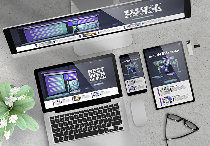
#4 Craft a Seamless User Experience Across Devices: Mobile Matters Most!
In today’s mobile-first world, where smartphones reign supreme, a website that isn’t optimized for mobile devices is like a store with closed doors during peak shopping hours. Here’s why mobile optimization is a must-have, not a maybe, for your B2C e-commerce website, and how it intertwines with Google’s mobile-first indexing approach.
Mobile Optimization: A Boon for Business and Google
Embrace Google Mobile-First Indexing: Google prioritizes mobile versions of websites for indexing and ranking. A mobile-optimized website ensures your products are easily discoverable by mobile searchers, which is a significant portion of online traffic.
Seamless User Experience: Imagine pinching and zooming to decipher product details on a tiny screen. Frustration, right? A mobile-friendly website provides a smooth, intuitive experience for users on any device, leading to increased engagement and conversions.
Faster Load Times: Mobile users are impatient. A website optimized for mobile loads quickly, keeping users engaged and reducing bounce rates (visitors who leave immediately).
Boost Sales: The easier it is for mobile users to browse, add products to their cart, and checkout, the more likely they are to convert into paying customers.
Enhanced Brand Image: A clunky, mobile-unfriendly website screams outdated and unprofessional. Mobile optimization portrays your brand as modern, user-friendly, and in touch with how your customers shop.
Responsive Design vs. Separate Mobile Website: Weighing the Options
Should you create a separate mobile website or leverage responsive design? Here’s a breakdown of both approaches:
Responsive Design: Pros
- Cost-Effective: Maintain one website codebase, reducing development and maintenance costs.
- SEO Friendly: Google prefers responsive design for its simplicity and ease of indexing.
- Seamless User Experience: One website automatically adjusts to any device size, ensuring a consistent user experience.
Responsive Design: Cons
- Complexity: Designing a website that flawlessly adapts to all screen sizes can be challenging, especially for intricate layouts.
- Load Time: Large desktop elements might need to be scaled down for mobile, potentially impacting load times on slower connections.
- Design Challenges: Responsive design for e-commerce sites requires a balancing act: condensing desktop content for mobile users without sacrificing crucial information, optimizing images for various screen sizes and data speeds, simplifying navigation with finger-friendly elements, and streamlining forms to minimize mobile typing. Rigorous testing across devices and with real users is essential to ensure a seamless experience that converts.
Separate Mobile Website: Pros
- Highly Optimized: Tailor the mobile experience specifically for smartphone users, potentially leading to faster load times and a more streamlined user journey.
- Greater Control: Complete creative freedom to design a mobile experience unique from the desktop version.
Separate Mobile Website: Cons
- Cost & Maintenance: Developing and maintaining two separate websites is more expensive and time-consuming.
- SEO Challenges: Managing SEO for two separate sites can be complex. Google might prioritize the desktop site if it deems the mobile version a duplicate.
- User Experience Inconsistency: Switching between a desktop and a separate mobile website can be jarring for users.
The Verdict: Responsive Design Wins (Most of the Time)
For most B2C e-commerce websites, responsive design is the clear winner. It’s cost-effective, SEO-friendly, and provides a consistent user experience across devices. However, if you have a very complex website or a large budget, a separate mobile website could be an option. Ultimately, the best approach depends on your specific needs and resources.
Remember: Regardless of the approach you choose, prioritize mobile optimization to cater to your customers’ shopping habits and conquer the ever-growing mobile landscape.